Free field guide · no signup

The static-ad rules we learned from 2,000+ renders.

This is the judgment layer of picasso, the AI static ad agent we built at Subyect. It is not the agent. These rules are tool-agnostic: they work in Claude, ChatGPT, Nano Banana, GPT Image, whatever you generate with. Because they're about how AI ads fail, not which model you use.

2,000+

Renders logged

33%

Of failures: scale

10

Hard rules

6

QA checks

How to use it

Paste this whole page into your AI tool, fill in the brand brief at the bottom, add your product photo, and ask for an ad.

Renders from the ledger

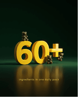
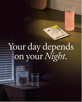
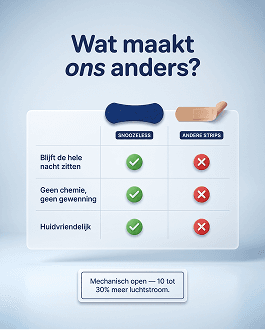
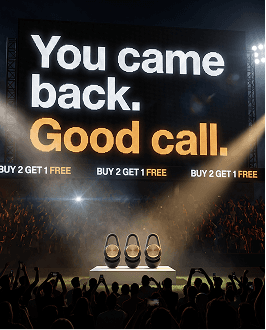
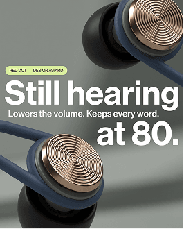
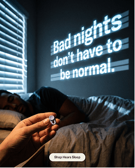
AI static ad render 1 of 12 from the picasso ledger
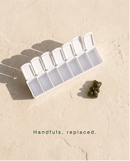
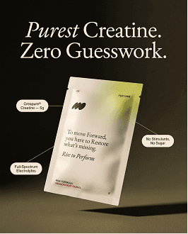
AI static ad render 2 of 12 from the picasso ledger
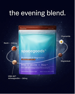
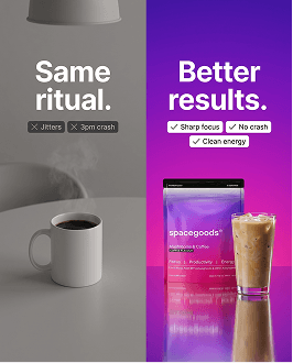
AI static ad render 3 of 12 from the picasso ledger
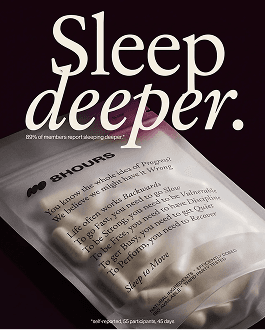
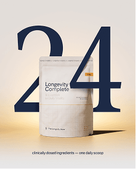
AI static ad render 4 of 12 from the picasso ledger
AI static ad render 5 of 12 from the picasso ledger
AI static ad render 6 of 12 from the picasso ledger
AI static ad render 7 of 12 from the picasso ledger
AI static ad render 8 of 12 from the picasso ledger
AI static ad render 9 of 12 from the picasso ledger
AI static ad render 10 of 12 from the picasso ledger
AI static ad render 11 of 12 from the picasso ledger
AI static ad render 12 of 12 from the picasso ledger

Rule 0

The packshot is the anchor, not the prompt

Everything else comes after this. A beautiful ad of a wrong-looking product is a failure.

Never describe your product in words and hope. Upload the real product photo as an image reference and tell the model: “reproduce the product EXACTLY from the reference image.”

The prompt is for creative direction only. Scene, light, mood, composition. Heavy product description in prose fights the image reference and causes drift.


1

The prompt structure

Build every generation prompt in this order. Concrete nouns early: the first 30 words carry the weight.

Prompt structure
[SCENE]        setting, surface, props, the story of the shot
[LIGHT]        physics, not vibes: where it comes from, what it does
[COMPOSITION]  camera angle, framing, where the product sits
[SCALE]        compare the product to an object with a FIXED real-world
               size on the same surface: a lime, an AA battery, a shirt
               button. Never a bottle cap or a capsule. The model can
               imagine those at any size.
[NEGATIVES]    3-5 hard "never" rules for your product
               (wrong color, extra parts, changed cap, added text)
[REFERENCE]    the packshot image + "reproduce the product exactly"
[ASPECT]       4:5 feed · 9:16 story · 1:1 square
[COPY]         only if the ad carries text: the exact copy verbatim,
               plus placement and scale ("wall-sized, fills the left
               two-thirds"). Big means big. Say it.

One job per prompt. When you iterate, name the single change and repeat what must stay, in one clause.

A worked example · fictional sleep gummy brand
A matte ceramic nightstand in a dark bedroom at 1 AM, phone face-down, glass of water. Light: a single warm bedside lamp from the left, soft falloff into deep navy shadow. Composition: low 30-degree angle, product standing center-right, phone and glass framing it. Scale: the jar is roughly twice the height of the AA battery lying beside the phone. Never: no altered lid, no extra jars, no text on the label beyond the reference, no purple tones. Reproduce the product exactly from the reference image. Aspect 4:5, the photograph fills the entire frame edge to edge. Headline "3 AM called. Decline." wall-sized in the upper third, starting no higher than 18% down the frame.

2

The 10 hard rules

Each one of these cost us real money to learn.

1

The image fills the full 4:5. Only text has a safe zone.

The number one AI ad mistake. One bad line ruined 10 of 15 ads in a single batch of ours.

Models love to letterbox your photo as a square inside the frame, wasting 20% of every impression you pay for. And if you write “keep everything inside the central square,” you cause it: the model reads “everything” as the photo. Paste this instead:

Paste this instead

"The photograph fills the entire frame edge to edge with no border or padding. Keep all TYPE within the central square: the headline starts no higher than 18% down the frame, the lowest text ends no lower than 82%."

A percentage the model can measure beats a band it must avoid.

2

Watch the scale.

Oversized products are 33% of every failure we ever logged.

A product rendered 1.5x too big still “looks about right” to your eyes. That's why the scale line uses a fixed-size comparator on the same surface.

3

Maximum 2 generative passes per ad.

One master, at most one text or edit pass. Every extra pass through a generative model degrades the product and burns money. If pass two didn't fix it, the prompt is wrong, not the seed.

4

Never let the image model draw small text or offer numbers.

We shipped a ‘60’ that the model had turned into a ‘50’. Digits, prices, pack microtext: real font layer in a design tool, or leave them out.

5

One image per generation.

Don't spray 4 variants and pick. Generate one, look, re-prompt the delta. Variants of a weak idea are still weak.

6

Generate at high resolution natively, upscale with a real upscaler.

Ask for 2k from the start: 1k masters garble small type. And never re-feed a good render through a generative model to “enhance” it. It will redraw your product.

7

The accent color is a design decision.

Never sample your headline highlight from the product's own colorway. Gold word on a gold product feels obvious and cheap. Take accents from the brand's design palette.

8

No grey slab behind the headline.

Image models drop a soft grey panel under type for contrast by default. It reads as AI, every time. Put copy on genuine clean negative space, and if there isn't any, re-compose the image so there is.

9

Text never overlaps the product.

If they collide, fix the image, not the text. Move or shrink the product until a clean band exists.

10

The image must carry the same subject as the copy.

If the headline is about her, she is the subject of the photograph. A good image plus good copy pointing at different subjects is a bad ad.

Rules stop the failures. They don't build the batch.

If you're spending €20k+ a month on Meta and creative output is the bottleneck, that's a system problem, not a prompt problem. 30 minutes. We pull your Meta data live and find the three biggest creative gaps.

3

Make it stop the scroll

The rules above stop failures. These five principles create winners. They come from the renders our clients approved, generalized.

One idea at monumental scale.

The best performers shout ONE thing: a giant number, a wall-sized word, an extreme macro. Busy frames with competing elements lose at thumbnail size. If the ad doesn't read in under a second on a phone, it doesn't read.

The visual demonstrates the claim.

Don't decorate the message, prove it. A sleep product bridging a snore waveform beats a sleep product next to the word “quiet.” Ask: can someone understand the claim with the copy covered?

Type and product as one artwork.

A flat sentence-case headline typed above a product photo, with one word tinted, is the universal AI-ad signature. Everyone recognizes it now. Make the type interlock with the product, live inside the scene (on a screen, a sign, an LED), or carry real weight contrast. Type that touches the world reads designed; type floating above it reads generated.

Light the frame like a film still, even for graphic layouts.

Flat fills and thin vector outlines read as templates. A luminous gradient ground, real shadows, and depth of field make even a comparison table feel premium.

For UGC-style ads: imperfect on purpose.

Too-polished “candid” content is instantly recognizable as AI. Real phone grammar: mild defocus, visible wear on products, an object in frame that has nothing to do with the category. Polish is the tell.


4

The QA check

Run this on every render before you spend a euro of ad budget on it.

  1. 01

    Transcribe every character.

    Read every word and digit off the pixels and compare to what you asked for, digit by digit. “Looks correct” is not a check. This is exactly how a wrong number ships.

  2. 02

    Measure scale as a ratio.

    Product height vs your comparator, in pixels if you have to. Compare to reality. Trust the ratio over your eyes.

  3. 03

    Count the products.

    Models duplicate. One product asked, one product in frame.

  4. 04

    Check the bands.

    Top and bottom 10% of a 4:5: no text, no logos, no key elements. And the photograph itself bleeds edge to edge. A padded square inside the frame goes back.

  5. 05

    Check the resolution.

    Shortest side under 1,000px means the tool silently downgraded quality. Regenerate at full quality, don't upscale your way out.

  6. 06

    The scroll test.

    Would this stop YOU? No checklist covers taste. That part is still yours.


5

The mini brand brief

Fill this in once. Paste it above the prompt every time you generate.

Mini brand brief
BRAND:      [name + product in one line]
BUYER:      [who buys it, and the feeling they're buying]
PALETTE:    [2-3 hex codes from your brand, for accents and grounds]
NEVERS:     [3-5 things that must never change on your product]
VOICE:      [your brand's feel in 5 words]

Need proven statics to pull inspiration from while you brief? 500+ of them, with psychology breakdowns: app.obyect.io/library


What this filecan't do

This is maybe 5% of picasso. The honest 95%: picasso runs on a logged ledger of 2,000+ renders where every rejection became a rule and every approved ad trained its taste. It knows how Meta's algorithm groups similar creatives, how to diversify a batch across formats, angles and awareness stages so ads don't compete with each other, and what YOUR brand's winning registers look like after weeks in the system.

None of that fits in a file.

Rules travel. Taste is trained.

Ready to start

Want picasso running on your brand instead of training your own for months?

This is for brands doing €100k+ a month where creative volume is the bottleneck. 30 minutes, not a pitch deck. I'll look at your ad account first and tell you what I'd test next, whether or not we end up working together.

Jens Loman · Subyect · Amsterdam